

Alright, alright, alright…..

I had been promising this for a few weeks, and I guess since I was recently successful in this challenge, I better keep my promise! So here goes…..
These are my notes which comprise a mix of strategy and technique on how I came up with and developed a winning entry on the Maven Telecoms Churn challenge #mavenchurnchallenge.
Delayed Start
Before we start, I note that my main constraint was that I had been back home in Ireland (after 4.5 years) on holiday for several weeks, and was thinking of giving this challenge a miss. I got back on 19th July, which left only a few days until the challenge finished, so thought I definitely would not have time.

However, that’s where my “friend” jetlag came in. I found myself wide awake for a few nights in a row between 12am and 4am, so I decided to do something useful and see if I could create an entry.

They say “necessity is the mother of invention”, and as I knew I would only have 2-3 nights to complete, I needed to create something fairly targeted and “simple”.
Scope and Brief
For those unfamiliar with the challenge the details are available at https://www.mavenanalytics.io/data-playground
The brief was to analyze demographic details and key account records of 7,043 clients at a Telecoms company and try to answer some of the following queries for the board:
- What constituted high value clients?
- What influences or drives churn risk?
- What steps can be taken to retain clients
Analysis Strategy
Keep it simple
As the brief was centred around defining high value and churn risk, I was thinking of ways to analyse just those two aspects. However, the data is not that straight forward. It contains information on age, tenure, services, costs, marital status, location, etc.
Remembering I had little time to create and weave a story looking at individual variables and creating a jigsaw of analysis, and also still recalling some of the analysis that I learned about in Maven Analytics Machine Learning courses, I thought it would be much simpler to create two metrics which combine multiple variables, as follows:
- Value metric – allowing me to combine value related variables to differentiate between high and low value clients
- Churn risk metric – allowing me to combine key churn risk variables to differentiate between higher and lower churn risk clients
Aim
Keeping the end user in mind (the board), I thought this approach of using summarised metrics had several benefits:
- Focused on the key briefing points
- Condensed a large number of variables i
- Made it easy to digest, with no need to look at multiple charts and tables and try to relate and correlate.
Visualisation Strategy
Staying with the theme of simplification, I wanted to create a simple flow, from high level customer revenue values, through to a slightly more detailed look at the spread of clients between value and churn risk, and then finally look at some summary key reasons for churn and recommendations to the board.
The simplification was also an attempt to limit any clutter in the visual. Looking back, if I was critical, maybe the kpi / BAN visuals may have had a little too much information, but I think in general I managed to control the amount of detail in the final product.
I sketched up and outline or wireframe on how I conceptually wished to present the info – see below.
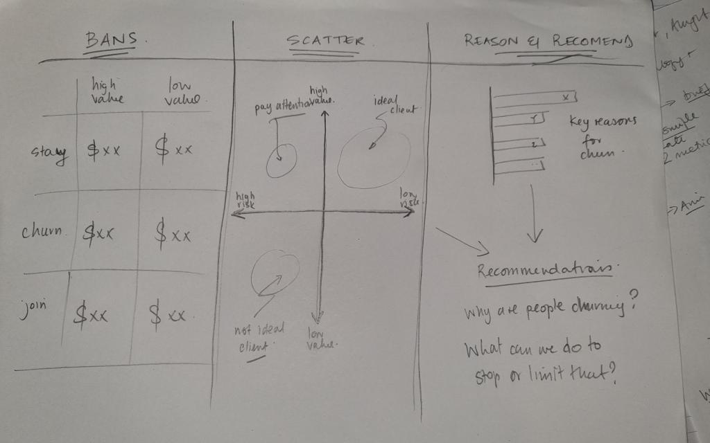
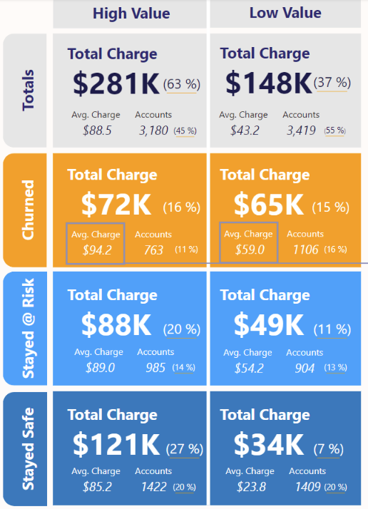
High – Low Big Aggregated Numbers (BAN)
The purpose of these were to give high level insights into the revenue split between high value and low value clients, and also further into staying, churning and joining clients.
I eventually added some additional information on account numbers and % values, but kept them small in size so that the focus was on the big numbers.
Scatterplots
The purpose here was to show a quadrant split between high and low value clients and those with high and low potential churn risk.
This could be overlaid with the coloured detail of staying, churning and joining clients to see which quadrants each type of client predominantly fell into.
Key Reasons
As I was using metrics that were combining many variables together, thereby making the original variables almost invisible, I thought it important to actually bring out a little data on at least the categories which contributed most to high churn risk.
This would also help form the basis of the recommendations.
Recommendations
The recommendations don’t need a detailed explanation, but the intention was to summarise what the BAN and scatterplots were saying, then make recommendations based on that, and taking into account the key categories contributing to churn risk.
Colour Association
To bring this all together visually, I decided to primarily rely on colour association to focus attention between staying, churned and joining clients. Having that intentional and consistent association across the entire visual means that there is limited need for legends, and the end user can easily scour the entire report for a particular category just by looking at that colour.
Gestalt Principles
As always, I would look to incorporate a few of these, such as enclosure, connection and continuity.
Technique
Ok, on to the juicy topic of technique and how this was actually executed. Firstly, all the work and analysis was performed in Power Query and Power BI.
Secondly, I took some inspiration from the Maven Analytics Machine Learning Modules 1 and 2, which I had taken in the months prior to this challenge.
Value Metrics
The first metric was the value metric. When looking across the variables, there were several that I could associate with ‘value’, namely:
- Referrals – someone who has actively added more clients to our network
- Tenure – a measure of loyalty and how long the client has stayed with our network
- Monthly Charge – clients total monthly charge
- Total Charge – clients total quarterly charge
- Total Revenue – revenue that the network has received from the client from their entire tenure
I decided to go with Referrals and Tenure as two variables, but wanted to pick only one of the charge/revenue related values. I decided to go with Monthly Charge for the following reasons:
- Total Charge was a quarterly figure. As the network had monthly contracts it is conceivable that there are clients that only joined in the last month or two, and their “quarterly” value would be skewed as a lower value than others.
- Total Revenue was tempting, but I think the spread between the maximum and minimum was so large, there would be a big differential. My view was that as I would already be considering Tenure as a variable factor, I could defer to just considering the Monthly Charge.
Calculation
Ok, so using the three variables and restricting the calculation to staying and churned clients, I created a normalised value by doing the following:
- Split the allowance between the variables in order of my perceived importance as:
- 60% Monthly Charge (MC)
- 30% Tenure (T)
- 10% Referrals (R)
- Created the following calculation in Power Query as per the following:
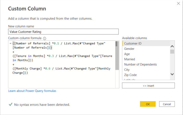
- Created a normalised version of this value (values 0 – 1) by using the standard formula below and the corresponding Power Query formula as follows:

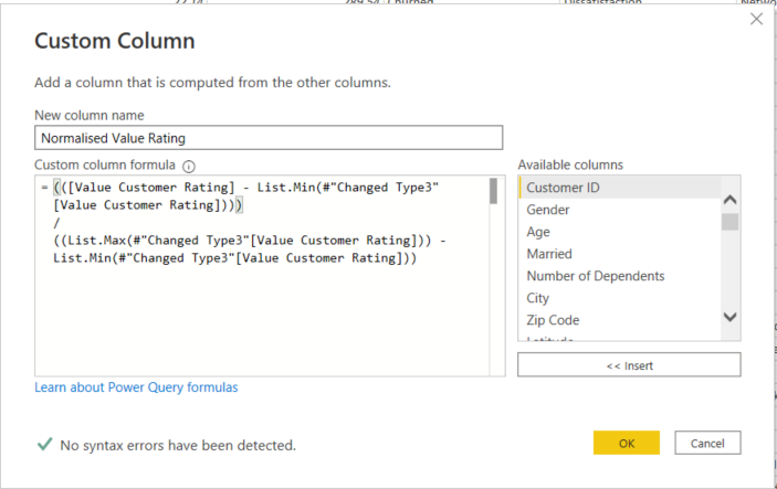
This provided a full set of normalised value ratings in a new column with a range similar to the sample shown below. The average shown here is 0.51, and the overall for the larger sample was approximately 0.52. This is the value I would use to classify whether a customer was higher or lower value.

Churn Metrics
This metric is again the normalisation of a sum of variables, however this one is a little more complex, as it includes several more variables, and the values used are the average values from the average churn:stay ratio.
Ok, that is a lot to consider, so let me break it down a little.
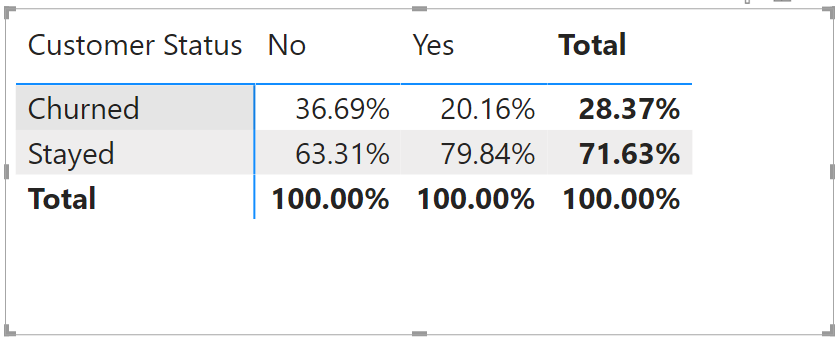
If you look at the overall split between churn and stay clients, it is approximately 28% churn to 72% stay.
Now, if you examine different variables you will see deviations from this value. For example, if you examine the contract type below you will see that although the total split is still 28%:72%, those clients with Month-to-Month contracts are actually 52%:48% in favour of churned clients. This represents a deviation of 24% from the average value, and suggests Month-to-Month Contracts as a significant factor in churn.
And, as such, the same for One and Two Year contracts suggests the opposite is the case.
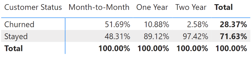
If we substitute the churned % values as deviations from the 28% average, we would get
- Month-to-Month = 28% – 52% = –24%
- One Year = 28% – 11% = +17%
- Two Year = 28% – 3% = +25%
The greater the negative value, the greater the likelihood that the variable contributes to churn risk.
Now, if we consider further variables, like the below split between married and unmarried clients, we can make the same type of calculation.
In the end, I used 16 variables as part of the overall calculation and aggregated the values to give an overall score. Below is the extract from Power Query.
Now as a caveat, I note that this is a lot of manual entry, and there is perhaps a more automated and efficient manner of calculating each number, but my jetlag symptoms meant I was more inclined to do this kind of manual calculation than do some additional research on an efficient M code series – I am open to feedback and suggestions on making this “smarter”.
= Table.AddColumn(#"Rounded Off", "Churn Risk Rating", each (if [Contract] = "Month-to-Month" then (0.2837-0.5169)
else if [Contract] = "One Year" then (0.2837-0.1088)
else if [Contract] = "Two Year" then (0.2837-0.0258)
else null)
+
(if [Married] = "No" then (0.2837-0.3669)
else if [Married] = "Yes" then (0.2837-0.2016)
else null)
+
(if [Payment Method] = "Bank Withdrawal" then (0.2837-0.3565)
else if [Payment Method] = "Credit Card" then (0.2837-0.1581)
else if [Payment Method] = "Mailed Check" then (0.2837-0.414)
else null)
+
(if [Offer] = "None" then (0.2837-0.2921)
else if [Offer] = "Offer A" then (0.2837-0.0673)
else if [Offer] = "Offer B" then (0.2837-0.1226)
else if [Offer] = "Offer C" then (0.2837-0.2289)
else if [Offer] = "Offer D" then (0.2837-0.2674)
else if [Offer] = "Offer E" then (0.2837-0.6762)
else null)
+
(if [Number of Referrals] = 0 then (0.2837-0.3611)
else if [Number of Referrals] = 1 then (0.2837-0.4734)
else if [Number of Referrals] = 2 then (0.2837-0.1135)
else if [Number of Referrals] = 3 then (0.2837-0.1296)
else if [Number of Referrals] = 4 then (0.2837-0.0773)
else if [Number of Referrals] = 5 then (0.2837-0.0824)
else if [Number of Referrals] = 6 then (0.2837-0.0374)
else if [Number of Referrals] = 7 then (0.2837-0.0247)
else if [Number of Referrals] = 8 then (0.2837-0.0097)
else if [Number of Referrals] = 9 then (0.2837-0.0177)
else if [Number of Referrals] = 10 then (0.2837-0)
else if [Number of Referrals] = 11 then (0.2837-0)
else null)
+
(if [Device Protection Plan] = "No" then (0.2837-0.4242)
else if [Device Protection Plan] = "Yes" then (0.2837-0.228)
else (0.2837-0.0841))
+
(if [Online Security] = "No" then (0.2837-0.4465)
else if [Online Security] = "Yes" then (0.2837-0.1495)
else (0.2837-0.0841))
+
(if [Online Backup] = "No" then (0.2837-0.4296)
else if [Online Backup] = "Yes" then (0.2837-0.2202)
else (0.2837-0.0841))
+
(if [Premium Tech Support] = "No" then (0.2837-0.4452)
else if [Premium Tech Support] = "Yes" then (0.2837-0.1552)
else (0.2837-0.0841))
+
(if [Streaming Movies] = "No" then (0.2837-0.3661)
else if [Streaming Movies] = "Yes" then (0.2837-0.3049)
else (0.2837-0.0841))
+
(if [Streaming Music] = "No" then (0.2837-0.3660)
else if [Streaming Music] = "Yes" then (0.2837-0.2989)
else (0.2837-0.0841))
+
(if [Streaming TV] = "No" then (0.2837-0.3641)
else if [Streaming TV] = "Yes" then (0.2837-0.3062)
else (0.2837-0.0841))
+
(if [Paperless Billing] = "No" then (0.2837-0.1793)
else if [Paperless Billing] = "Yes" then (0.2837-0.3523)
else null)
+
(if [Internet Service] = "No" then (0.2837-0.0841)
else if [Internet Service] = "Yes" then (0.2837-0.3348)
else null)
+
(if [Internet Type] = "Cable" then (0.2837-0.2752)
else if [Internet Type] = "DSL" then (0.2837-0.1997)
else if [Internet Type] = "Fiber Optic" then (0.2837-0.4213)
else (0.2837-0.0841))
+
(if [Tenure in Months] <= 12 then (0.2837-0.5987)
else if [Tenure in Months] <= 24 then (0.2837-0.2871)
else if [Tenure in Months] <= 36 then (0.2837-0.2163)
else if [Tenure in Months] <= 48 then (0.2837-0.1903)
else if [Tenure in Months] <= 60 then (0.2837-0.1442)
else if [Tenure in Months] <= 72 then (0.2837-0.0661)
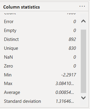
else null))Examining the results of a sample 1000 clients below shows a resultant minimum value of -2.29 and a maximum value of 3.08, with an average close to zero, which is what to be expected. The clients with the most negative value should in theory be more likely to be at risk of churn.
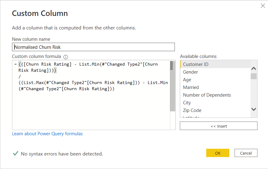
Now, instead of using this spread, I decided to normalise these values again, using the below formula in Power Query
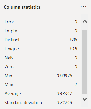
Looking again at the results of a sample 1000 clients, the min and max were close to 0 and 1, and the average was around 0.43, which was actually the average for the entire data set.
Now this was done, the last step I made in Power Query was to re-categorise the Joined and Stayed client status based on these normalised values. If the normalised value was greater than 0.43, then it is likely that Joined or Stayed clients will remain and be “safe”. However, if it is less than 0.43 there is a higher risk that the client will churn, and would therefore classify as “@ risk”. Below shows this step:
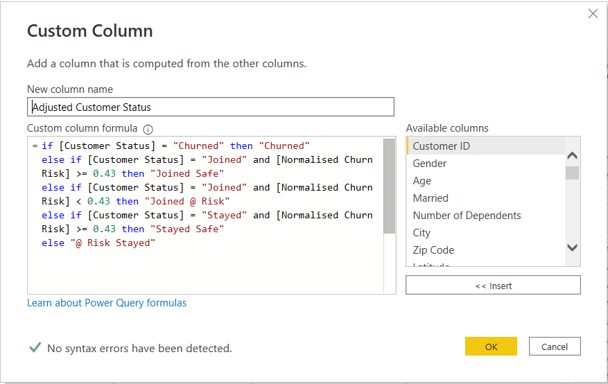
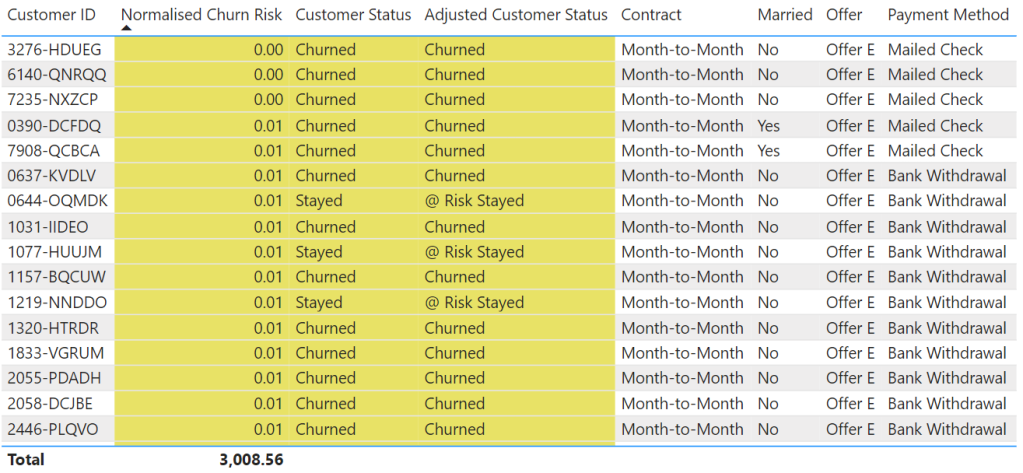
Looking at two tables showing the extremes of the normalised values demonstrates the original and adjusted customer status based on the assessment. It shows that those clients with low scores who have actually stayed are probably at risk of churning in the future.
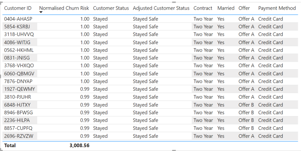
At the opposite end of the scale, pretty much anyone who scored a very high rating was a staying customer and not at risk of churning.
Phew, that was a lot to consume and relive…..I think most was done in a haze the first time round, but that is the main grunt work complete.
One final data manipulation task was to do a little pivoting magic to help me create my Top 12 churn variables.
Top 12 Churn Variables – Pivoting
This was fairly simple. The first step was to create a duplicate of my table inside Power Query.

Next, I selected all the variables I had used in my analysis, and unpivoted them using the below M code
= Table.Unpivot(#"Added Custom4", {"Number of Referrals", "Tenure in Months", "Offer", "Phone Service", "Internet Service", "Internet Type", "Online Security", "Online Backup", "Device Protection Plan", "Premium Tech Support", "Streaming TV", "Streaming Movies", "Streaming Music", "Contract", "Paperless Billing", "Payment Method"}, "Attribute", "Value")This then gave me two columns that looked a little like this for each individual client.
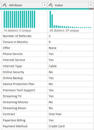
The final step was to actually join these two values together (separated with a | )to create combined variable, like the below:

I could use this combination of variable and value to see which combination of each was most likely in churning customers.
Ok, so now we can get on to actually creating the visual – I am starting to think writing this blog is taking more work that creating the visual at the time!!!
Building the Visual
Background
Just to note that the immediate background and rounded transparent white border were created in powerpoint. This allows a few more effects to be created than you can in Power BI, and also means it is a few less components that affect performance. There are various Youtube tutorials on how to do this.
BAN – Kpi
The BAN Kpi cards contained several pieces of information, namely:
- Total Charge (Monthly)
- % of the Total Charge
- Average Account Charge
- No. of Accounts
- % of Total Accounts
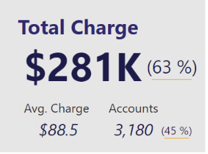
That’s actually quite a lot of information. Obviously, the focus was on the Total Charge with a larger and more prominent font, but the other values were provided in case someone wanted to go back for a second look and deeper dive later on.
The DAX for the calculations followed similar patterns for each of the BAN and are a good contender for using “Calculated Groups”. In this instance, I was looking at High Value, therefore the Total Monthly Charge was filtered for clients with a normalised value rating higher than the average of 0.52.
Total Monthly Charge - High =
CALCULATE([Total Monthly Charge],
FILTER(telecom_customer_churn,telecom_customer_churn[Normalised Value Rating] >= 0.52
)
)
After having all these calculations I was able to copy and paste to create this stack of BAN / Kpis
Scatterplot
Next came the scatter plot. The hard work was all done in Power Query. So this was simply a matter of dragging and dropping, and applying some simple filters as shown below, as well as applying the consistent colour coding.
You can see the effect that the normalised churn risk value has, where we see the vast majority of churning customers had higher than average churn risk

Splitting Churned, Stayed and Joined
Having completed these charts for the churned and stayed clients, it was a matter of applying the same format to the newly joined clients.
Examining this, it looks like there are a high number of new clients that have a high churn risk. This should sound a warning alarm to the board.
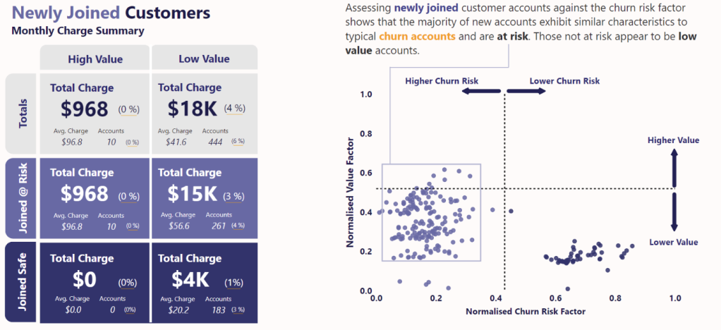
Reasons
Again, the hard work was done using unpivot in Power Query. So it was simply drag and drop, and filter for the top 12 items.
Here we see the power of that unpivot – we can look at all the variables in a single column and see which were most prevalent in churned customers. For example, Month-to-Month Contracts had 1,655 churning customers.
As mentioned earlier, this is a good additional chart to provide supporting information and context should the board want to know at a high level what the top churn risk variables are.

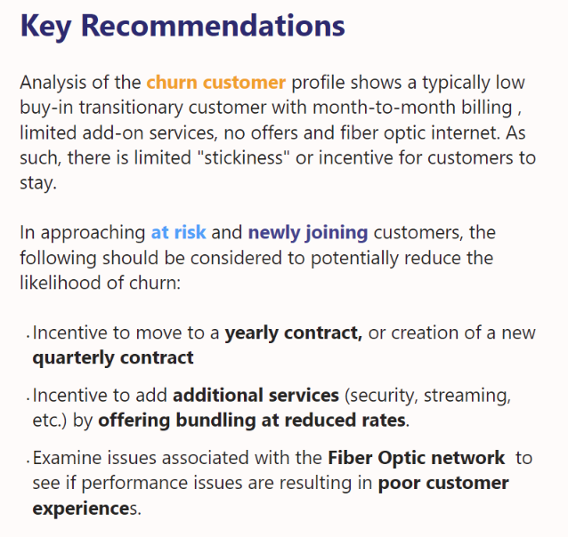
Recommendations
Last, but not least, are the recommendations. These were written to offer some potential steps to reduce the evident risk of churn. They were closely aligned to countering the top reasons for churn.
Final Product
Below shows the final product together. Apart from the above commentary, there were a few other aesthetic items considered which are worth mentioning in addition to the colour.
- space – I made sure there was some “breathing room” between adjacent visuals and also between enclosed areas. This helps to reduce the visual burden and overload.
- enclosure – I used enclosure to purposely segregate certain sections to reinforce the fact they were in a group. On a larger scale this would be the two large white boxes on the left, so they could be looked at and assessed in isolation. On a smaller scale you will see I used boxes in the scatterplots to show grouped values.
- connection – following from the above, I used connecting lines to link text to areas within charts and visuals
- alignment – to try and improve aesthetics I made sure the text, visuals and charts were aligned with each other to promote clean lines and help with keeping white space
So, that’s my lot. I think you might agree, this visual is a little like a duck in water – it looks quite calm and relaxed on the surface, but there is definitely a lot of paddling going on below the surface.
I was extremely happy to make the final selection again, and even more pleased when I was announced as the winner, becoming a two time winner, and achieving it in a solo capacity this time round.
If you enjoyed this blog, or have and feedback on it’s content or on my methods, please let me know., either here or in my second home (LinkedIn).
If you think an accompanying video might be useful, also hit me up. If I have enough requests, I will try and fit it in.

Thanks a lot Gerard, it worked, I can see the problem was with the parenthesis
LikeLiked by 1 person
This is the full calculation used
([Value Customer Rating] – List.Min(#”Changed Type1″[Value Customer Rating])) /
(List.Max(#”Changed Type1″[Value Customer Rating])) – (List.Min(#”Changed Type1″[Value Customer Rating]))
Thanks
LikeLike
Try this
([Value Customer Rating] – List.Min(#”Changed Type1″[Value Customer Rating])) /
((List.Max(#”Changed Type1″[Value Customer Rating])) – (List.Min(#”Changed Type1″[Value Customer Rating])))
LikeLike
This is an amazing work Gerard, I am trying to replicate this to learn and I can’t get past the normalization part, I keep getting Normalized Value Ratings greater than 1, Can you please help
LikeLike
Do you have a screenshot of your work?
LikeLike
I couldn’t get a copy of the screenshot here, but I here is a link to the screenshothttps://drive.google.com/file/d/1Rfe9FYYx-XOfLmfhHmtZiXwwOUMD0J-u/view?usp=sharing
LikeLike
Yes, here is a link to the screenshothttps://drive.google.com/file/d/1Rfe9FYYx-XOfLmfhHmtZiXwwOUMD0J-u/view?usp=sharing
LikeLiked by 1 person
Are sure the entire calculation is correct. I can only see the final part, but it looks like the parenthesis may be incorrect.
I see
(List.Max(#”Changed Type1″Value Customer Rating]))
The second closed parenthesis shown here, makes me think that this part of the calculation is being executed incorrectly. Please check how each set of parenthesis is being used.
Thanks
LikeLike
Thank you Mr Gerard for the explanation, but please a walk through video will also much more.
LikeLike
Thanks Ben Joan, I’ll try and create the video.
LikeLike
Great work Gerard. That was an amazing report by standard…. simple but effective. I think a walk through video will be of great help to some of us have a firm grasp of the concept.
LikeLike
Thanks Edward for your comment. I will have a think about how to structure.
Would you prefer a focus on the data prep and power query side, or on the building of the visuals?
LikeLike