I have created a walkthrough so that you can use just 6 DAX formula to develop data extracted from your social media accounts into a metrics dashboard like that below, whether that be LinkedIn,Twitter, blog accounts or your own website.
Sample Fictional Data from LinkedIn Corporate AccountLinkedIn Metrics Dashboard developed in Power BI
From the video, you will see that I used six key DAX expressions or formula again and again to create a comprehensive set of metrics to allow you to develop the dashboard. Here they are in order of development.
Totals
Total LinkedIn New Followers =
SUM(LinkedIn_Data[LinkedIn New Followers])
You can use SUMX in lieu of SUM if you wish here, noting you will need to provide a table and expression in lieu of a column.
Year to Date (YTD)
LinkedIn New Followers YTD =
TOTALYTD(
    [Total LinkedIn New Followers],
    LinkedIn_Data[Date]
)
Latest Month (MTD)
LinkedIn New Followers This Month =
Calculate(
    [Total LinkedIn New Followers],
    LASTDATE(LinkedIn_Data[Date])
)
LinkedIn Followers Diff MoM =
VAR CurrentS = Sum(LinkedIn_Data[LinkedIn New Followers])
VAR PreviousS = [LinkedIn Followers Previous Month]
VAR Result = CurrentS - PreviousS
Return
    Result
One simple bonus DAX formula that will extract the latest date in your date table. This is useful for title blocks and banners in you reports and dashs, as it will automatically update when you add your monthly data.
Latest Date =
LASTDATE(
    LinkedIn_Data[Date]
)
Resulting Data
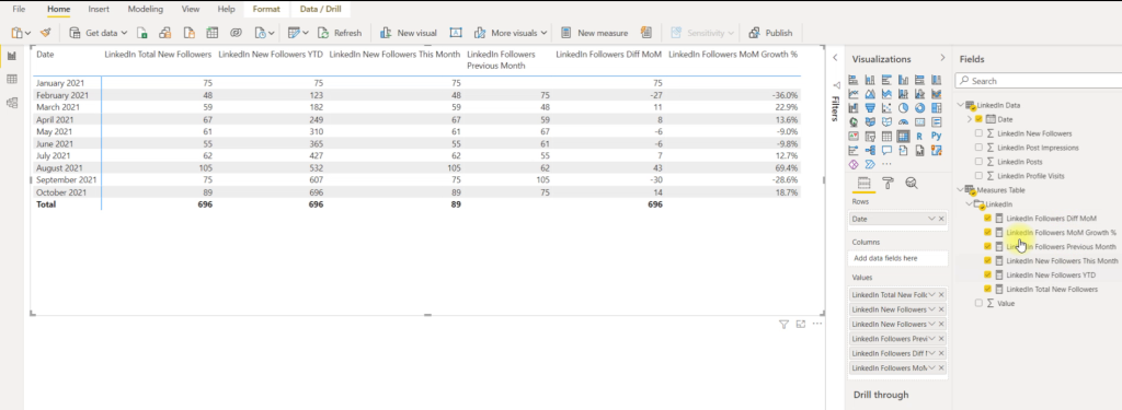
Once I have developed a set of calculations, I like to test them in a matrix to make sure they have the desired outcome. This is what I have done below. You can then be confident that the cards and visuals you create accurately reflect your data set.
Resulting DAX calculations with verification table showing outcomes
Comments and Feedback
If you have any comments, feedback, or requests, please let me know below or leave a comment on my Youtube channel.
This is a brief follow on to my earlier blog on the Maven Analytics NYC Taxi challenge, and cleaning well over 25 million line items of data in Power Query, before developing a Power BI dashboard. In particular, I am looking at amending an “If/And” statement to become a nested “If/Or/And” statement.
One of the cleaning steps involved looking at values in multiple columns to check that if they were ALL negative, then we should change each value to a positive (multiply by -1).
Original M Code
To do the above, my original M Code involved adding a new column which returned a statement based on a set of IF/AND statements
= Table.AddColumn(#"Changed Type", "negative_charges",
each if [fare_amount] <0 and
[extra] <0 and
[mta_tax] <0 and
[improvement_surcharge] <0 and
[congestion_surcharge] <0 then
"all negative" else
"ok")
This effectively adds a new column called “negative charges”, with each row value being returned as either “all negative” or “ok” based on the if statements.
So, if the fare amount, extra, mta tax, improvement surcharge AND congestion surcharge were ALL negative for that particular journey, then the result would be “all negative”.
However, if one or more were greater than or equal to zero, they would be deemed “ok”. This would allow us to then amend values in rows which were only calculated as “all negative”.
Minor Problem
It was pointed out to me however, that the [congestion surcharge] may also contain ‘null’ values. These would not be considered in the above calculation. Typically, we may consider ‘null’ to equal zero, therefore it would not matter; however for these surcharges, ‘null’ may mean that the surcharge was not being applied at that time.
Therefore, I had to look at amending the M code to accommodate this.
Updated M Code Solution
In the end, the amendment is not so complicated, but you can create a nested conditional statement by wrapping it in parentheses – see below amended M code. This allows you to check for multiple Or and And conditions and return the appropriate result.
= Table.AddColumn(#"Changed Type", "All Negative Check",
each if ([fare_amount] <0 or [fare_amount] = null) and
([extra] <0 or [extra] = null) and
([mta_tax] <0 or [mta_tax] = null) and
([improvement_surcharge] <0 or [improvement_surcharge] = null) and
([congestion_surcharge] <0 or [congestion_surcharge] = null) then
"all negative" else
"ok")
If you want to see this in action, I have created a short walk through on my youtube channel here.
This is a walkthrough of the cleaning I undertook on excess of 25 million lines of data as part of the #maventaxichallenge , which is the monthly data visualization challenge set up by Maven Analytics. This month the challenge involved looking at detailed NYC Taxi data between 2017 and 2020 and developing a usable single page dashboard to analyze weekly trends.
Details of the challenge can be found here. This includes the data files being provided and the requirements for cleaning and presenting the data. I have also created a walkthrough of the below on a video linkif you want to see it in live action.
Plan
My plan was fairly simple but structured:
Write a clear list of the cleaning steps linked back to the data dictionary
Create a Data Sample
Apply the cleaning steps to the sample and verify
Copy out the M Code for each step
Load the full data set and apply the M Code for each step
Step 1 – Cleaning List
So, the following were the steps required, and what that translated into using the data dictionary:
Cleaning Request
Data Dictionary Translation
Let’s stick to trips that were NOT sent via “store and forward”
store_and_fwd_flag = N
I’m only interested in street-hailed trips paid by card or cash, with a standard rate
Let’s assume any trips with no recorded passengers had 1 passenger
If passenger_count = 0 or null, then replace the 0 with 1
If a pickup date/time is AFTER the drop-off date/time, let’s swap them
If lpep_pickup_datetime > lpep_dropoff_datetime then lpep_dropoff_datetime else lpep_pickup_datetime
if lpep_dropoff_datetime < lpep_pickup_datetime then lpep_pickup_datetime else lpep_dropoff_datetime
We can remove trips lasting longer than a day, and any trips which show both a distance and fare amount of zero
add column lpep_dropoff_datetime – lpep_pickup_datetime then filter out values >= 24 hours
if trip_distance AND fare_amount = 0 then filter out values
If you notice any records where the fare, taxes and surcharges are ALL negative, please make them positive
if fare_amount <0 and mta_tax <0 and extra <0 and improvement_surcharge <0 and congestion_surcharge <0 then “all negative” else “ok”
then apply “trick” replacement to change values (see below for more detail)
For any trips that have a fare amount but have a trip distance of 0, calculate the distance this way: (Fare amount – 2.5)/2.5
If fare_amount > 0 And trip_distance = 0 Then ((Fare amount – 2.5) / 2.5) Else trip_distance
For any trips that have a trip distance but have a fare amount of 0, calculate the fare amount this way: 2.5 + (trip distance x 2.5)
If trip_distance > 0 And fare_amount = 0 Then (2.5 + (trip_distance x 2.5)) Else fare_amount
Cleaning Requests and Action Steps
Step 2 – Create Data Sample
It would be next to impossible to apply the steps to over 25 million lines of data and then easily verify that all the filters, additions, replacements and modifications had taken place and you got the results you were looking for.
A much more digestible method is to recreate a sample data set based on the data we were provided, and ensure that at least one example of each cleaning step scenario listed above is included.
To do this, I took the smallest file (2020), and performed a series of deduplications on values across the locations, passenger numbers, etc. so that I was able to get a small sample of approximately 50 varied line items.
Then, in order to recreate some of the cleaning scenarios, I made minor adjustments to some values. e.g. swap the drop off and pick up times. Above is the resulting sample data set.
Step 3 – Apply Cleaning Steps to Sample and Verify
Next, I created a new PowerBI file, uploaded the sample data set and then moved to edit the set in Power Query.
Sample data in Power Query
After performing the usual steps on checking data types (text, date, time, numbers, etc) have been applied, it was then a case of applying each cleaning step, and working through. For example, the first step became: =Table.SelectRows(#”Changed Type”, each [store_and_fwd_flag] = “N”)
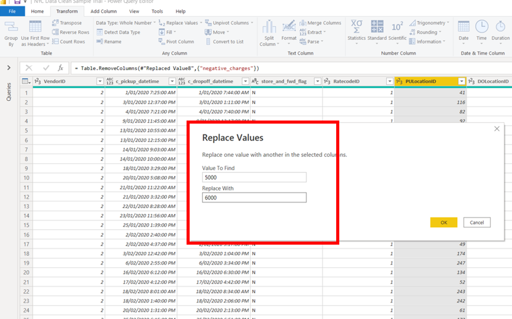
M Code Replace Hack
There is one hack that is really worth highlighting here, and will save some added columns and processing time in your Power Query tasks, especially in larger data sets. The below gallery shows a snapshot of each step, but here is a brief description:
Create a “Dummy Replace” step for the column you which to replace values on.
Select the Transform ribbon, and click on Replace Values (picture 1)
Choose two dummy values to replace that would not be values in your column. As an example here, I chose replace 5000 with 6000 (picture 2), where most values would actually be single digit values in that column.
Click OK, and you will see the M code in the formula box at the top (picture 3)
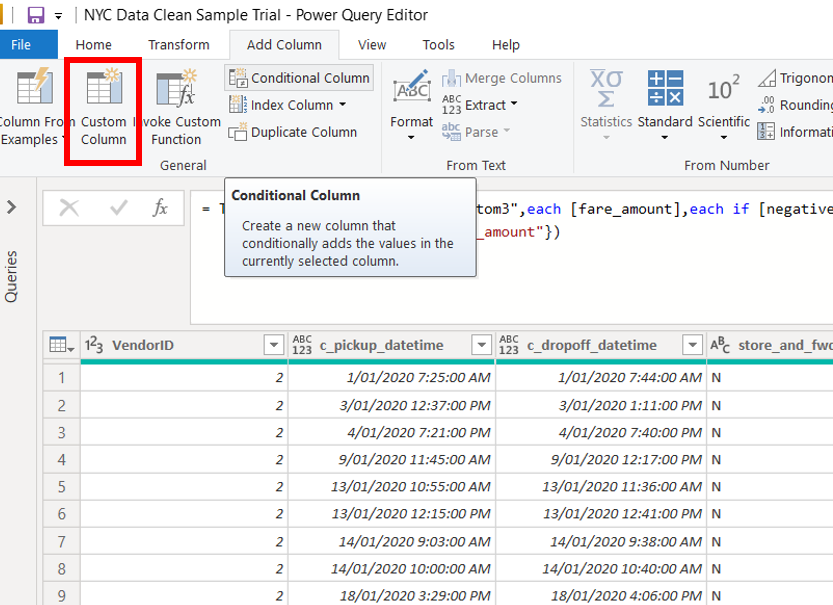
Create a “Dummy Custom Column” step to allow you to write the conditional statement you want to insert into your Dummy Replace code
Select the Add Column ribbon, and click on Custom Column (picture 4)
use intellisense to help you write the conditional statement you wish to create (picture 5)
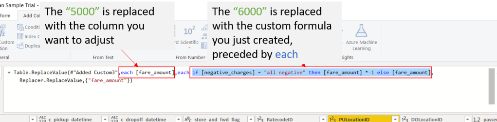
Copy the statement, and click cancel. This way you are not creating an additional column.
Return to your Dummy Replace step and perform the following:
For the first value (5000), amend this value to refer to the column you want to replace values in, and precede it with “each”.
In this example, I replace 5000 with each [fare_amount]
For the second value (6000), amend this value to refer to the conditional statement you want to apply to the selected column, and again precede it with “each”.
In this example. I replace 6000 with each if [negatives_charges] = “all negative” then [fare_amount]*-1 else [fare_amount]
Once you hit return, the replacement of values occurs within the column, without the need to create an additional column. This will increase efficiency for any refreshes.
If you are interested, the “normal language” logic behind this step is:
For each row value in the the column fare_amount, if the corresponding row in the negative_charges column is equal to “all negative”, then we would like to multiply the fare_amount by -1, thus changing it from a negative to a positive value. Else, if it is not “all negative”, then just keep the fare_amount value as it is (no change).
Step 4 – Copy out M Code
Once you have gone through each of the steps on your sample set and verified that it has had the desired effect on you line items, you will now have the list of steps under your Applied Steps on the right hand side of the Power Query interface. A good tip is to rename these steps based on your need (e.g. Change Negative Values or Swap Dates). This will help when you want to copy steps to use in the full data set.
You can see a list of this information in the Advanced Editor Window (see below). This can be copy and pasted out and saved for future use.
If you click on each step you will see the corresponding M code just above your data table.
Advanced Editor showing M Code Steps
There is another way that I learned from the Curbal Youtube page, which is pretty powerful. I wont repeat all the steps here, but here is a link to the tutorial.
Step 5 – Apply to Full Data Set
Now that you have your all your steps and code written, tested and verified, it is now a pretty straight forward proposition to apply them to your full data set.
An easy way to add steps, is to right-click on a step then select “Insert Step After” (see below). This will then allow you to paste in the M code that you have saved. One tip is to check the step reference. It will refer to the name of the preceding step. Therefore make sure you do that in the first instance. For following steps, it should be easy to use your copied values from the sample data, provided you use the same names for your steps.
Insert Step
Once you have completed all your steps, you are done – all that’s left to save is Apply and Close.
The “trial and error” approach is removed, which means that when Power BI applies the updates to the 25 + million line items, you can be reasonably confident you will not have to revisit your Power Query. This is important here, as with such large data sets, the updates can sometimes take hours to complete depending on your computer’s processing capabilities.
You are now free to move on to the next part of the challenge and concentrate on creating you DAX calculations and a nice neat dashboard.
If I have time to finish my dashboard on this one, I will add it on a future post. As always, any comments or queries, please let me know in the comments below!
Everyone loves a BAN (Big Aggregate Number). They are your all important key numbers in your dataset and should be jumping off the screen and and ingraining themselves in the back of your retinas!
But the standard way of creating them in Tableau can be a bit dull and monochrome.
Below I’ll step through the usual way of creating a set of BAN, followed by 5 quick tips to take them up a level in a recent dashboard I created as part of a Maven challenge
Standard BAN Creation
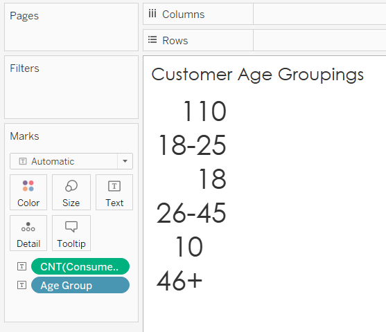
Normally, you will have a relatively small set of categories that you wish to show an aggregate value for (example being “Age Group” below.
We traditionally create this by dragging the category (Age Group) into the columns, then pulling the calculation into Text marks area.
Voila! We have a BAN. Not very pretty, but a BAN all the same.
You can adjust the header and value for font type, size and colour. Normally, that is about as far as most people go.
What’s the alternative?
But hey – what if you want your BAN in a single horizontal or vertical line, or you want to colour code based on the category or value?
What can we do to customise our BAN and make it that little more memorable?
5 Simple Tips to go from “Boring BAN” to “Badass BAN”
1. Orientation
It is easy to change from a single horizontal to a vertical line, by simply dragging the category from column to rows. This allows you to maximise your data real estate depending on how how you are structuring your overall visuals.
2. Headers
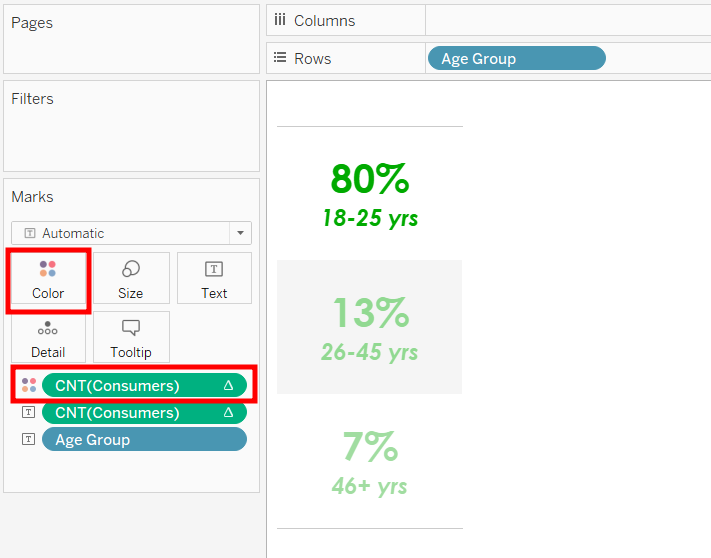
We can drop a duplicate category “Age Group” onto the Text marks card. Then right click on the category header and select remove. This will result in the second image below – still not too pretty, but we are on our way.
You can keep the category above or below the BAN by shifting it up or down on the marks card.
However, my preference is to keep it below, as it keeps the focus on your Big Number!
3. Font
Many people may have different views, but my preference is to keep a single font on a dashboard. Having multiple fonts can become an unwanted distraction and give a clunky look.
4. Size
For the numbers, bigger is better!! Make the size of the numbers much larger than any adjacent text to emphasize the contrast.
To do this, select the Text icon in the marks card, and click on the three little dots on the side.
This will bring up the “edit label” input box. Here you can adjust the size and font attributes (bold, underline, italic). In my example, I chose 36 for the Aggregate Number and 16 for the underlying category.
5. Colour
Adding some colour can help place emphasis on numbers or categories, and help improve the aesthetics and feel of your visual.
Ctrl dropping the category onto the colour mark would allow you to assign distinct colours based on each category, whereas Ctrl dropping the calculations “CNT(Consumers)” onto the colour mark will allow you to assign colour.
You can also maybe apply a quick table calculation. Here I opted to show a % of total, rather than the straight numbers. This gives a good overall perspective. As shown in the below picture, you can right click on the aggregate number and select the quick table calculation.
Lastly, in my example, I opted for adjusting the colour based on the BAN value itself. As I wanted to draw the eye to the highest value, I used a diverging scale from a green (#00aa00) to a white, which was offset at -20%. This enabled my lowest value to still be almost visible, while keeping the focus squarely on the largest number.
Overall
I was pretty happy with the outcome, and was able to apply the same effect to two sets of BAN. This helped maintain the overall important consistency and look when they were brought into the main dashboard.
What do you think?
As always, if there are any questions or comments, please reach out. I am happy to help where I can, and always open to feedback on alternative methods and learning new tricks from the data fam.
It was that time of the month when Maven Analytics set their data playground challenge – #mavenrestaurantchallenge. This time it was using 5 separate csv data tables detailing consumer and restaurant data from cities across three states in Mexico during 2012.
The brief was to
assume the role of a Lead Analyst that scopes out new restaurant opportunities abroad
review and analyse the data provided for interesting patterns and trends
develop a single page visual that gives potential investors a good understanding of the market to guide them in making investment decisions
post your final proposal on LinkedIn for review by Maven and fellow challengers
My Plan
As the final product was going to be a single page (jpg) being viewed on LinkedIn, it makes sense to keep the visual:
Simple and clean with a consistent palette
Structured and flowing, telling a progressive story
Clear in terms of visibility of graphics and legibility of any text
I landed on asking three simple questions:
Who? – who were the key demographic to target in terms of age and smoking/drinking habits
Where? – which city or location had the highest ratio of consumers to restaurants
What? – what kind of cuisine should a restaurant serve based on popularity and levels of current availability
My Solution
I decided to use Tableau for this challenge to try out some newly acquired skills. The below was my final proposal posted on LinkedIn, as well as on my Tableau Public Account
I will share some tips on how I made a few of the visuals in a follow up blog. If anyone reading has any queries on any part of the visual or it’s development, drop me a comment, and I’ll be happy to provide further detail.
Hello, and welcome to DG Analysis, a look into the varied world of data analysis and the tools used to present it.
My interest in data analytics has spawned from a ‘side-hustle’ at work which has led me from the basics of simple excel spreadsheets to the world of Power BI DAX and Tableau, and most things in between.
Join me in looking as I take part in various online data analysis and visualisation challenges, and share my strategies and processes as I go, as well as any tips and tricks I can impart along the way.


You must be logged in to post a comment.